Give Visual Studio a new look with a custom theme

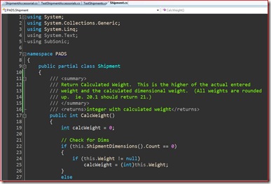
I've been asked a few times recently about my Visual Studio look and decided to share about it here. Visual Studio gives the developer a lot of control over how the development environment looks. From my experience, only a small percentage of people actually take advantage of it, but it is sometimes nice to change things up a bit.
Finding a Theme
The easiest way to give Visual Studio a "makeover" is to download someone else's custom Visual Studio theme and import it into your environment. My current theme is based on Ragnarok Grey by Tomas Restrepo. Tomas is a master dev environment themer and has made a bunch of Visual Studio themes. That said, the best place to start looking for your theme is likely at Scott Hanselman's VS Theme gallery post. Scott has put together a nice list of VS Themes along with pictures and links.
Installing a Theme
 Once you've found a theme that you like and found a download link, you should have a .vssettings file. (Note: Make sure you get the file for the version of Visual Studio you are using. They can be converted, but that is another topic.)
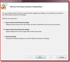
Now, you simply need to import it in Visual Studio. Luckily, there is a simple Visual Studio wizard to walk you through the process and make a backup of your current settings should you want to go back to what you have now.
The wizard is found under the Tools menu and the option is called Import and Export Settings. In 3 simple steps, you chose import settings, save your theme (or skip), and then browse out to find your downloaded theme and apply it.
Customizing a Theme
 The changes from a downloaded theme can be pretty dramatic and you might want to tweak it a bit. You might want the font size smaller or larger. Maybe just a different font. You might all find that you have some things that just don't look nice.
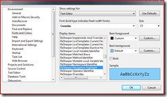
Head on into options (Tools...Options) and make the changes that you need. The Fonts and Colors sections gives you a nice preview of what you'll be getting for the different types of items.
My theme
As I mentioned earlier, I've been using pretty much the stock Ragnorak Grey theme. I have made a few small changes for ReSharper 4.0 EAP. The theme didn't cover the ReSharper Styles and a few of them were just unreadable. So if you a ReSharper guy or gal, you'll likely need to check those ReSharper display items and make sure they are readable in the theme you choose.
